The Webdev Experience
Built with Hugo
This site is built on SCSS, Bootstrap, and Hugo, which has proven to be a pretty cozy combination. Hugo’s templating engine isn’t the greatest (hard to read and write) but it does work, and writing the content itself in markdown is pretty nice. Bootstrap is basically only used to clean-slate the browser’s CSS choices so I have less browser variety to deal with. SCSS is used to build the stylesheets, though much of the fancy stuff (like the palette) uses plain old CSS vars and the like instead of anything SCSS provided.
It’s a nice combination and I have yet to touch javascript for this (this site has none) so I’m more than happy with it.
The lack of background-aware text.
This theme you’re looking at is a port of a RTUI stylesheet, and among the other fancy things I’ve managed to do within RTUI’s stylesheet engine, I implemented ‘background aware’ text elements.
Instead of having to set text color per usecase by myself if the background is too light or too dark, the text element can check the primary color of its background element and compute the contrast, automatically swapping to light or dark based on that.
Needless to say CSS can’t do this and while this site emulates the effect for nested boxes, it can’t actually do it, I had to manually specify it for different backing elements.
.obox .obox .obox)
.obox isn't supported for other reasons (while it is in the RTUI sheet, the color palette just wraps around, but CSS can't be that fancy and I have to specify it manually for the different nesting levels.)
Palette-oriented UI.
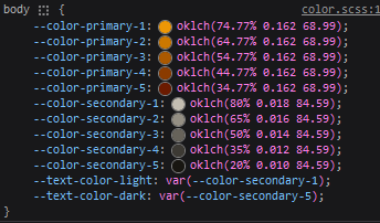
This entire site gets its coloration from a central palette specified on the body. Everything is figured out dynamically from there. I just think this is neat, and it makes tweaking the coloration globally much more reliable.

As a bonus, this allows me to use a very simple trick to create the light theme: The order of colors in the secondary palette gets reversed for light mode usage.
I’ll be real, I have no idea if this is a standard approach or anything, I’m not actually a UI designer and I just picked up some ideas from throwing things at the wall.
Contrast modes.
So, for some reason, while Firefox allows me to test light/dark very easily (this sight supports a light mode, based on OS preferences!) it doesn’t have easy ways to test the other media options like prefers-contrast. The site in theory should switch to higher contrast text colors if the pref is set to more, but I can’t easily test this as far as I know, which is a shame.
Chrome sub-pixel rendering.
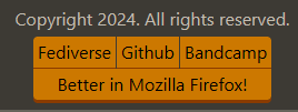
Chrome attempts to render elements with subpixel accuracy. Good, right? Well.. Here’s how this site’s buttons look in firefox:

And here’s how Chrome presents the same group of elements as of writing:

Can you see it?
The edges of the buttons have a halo effect in chrome due to badly applied subpixel rendering. It’s even more prominent in the titlebar buttons. WHY?! This is apparently machine specific too, so the buttons will simply never look correct for some viewers. Pain.